Stop the Spots: Reverse Engineering the Hirst Spot Painting
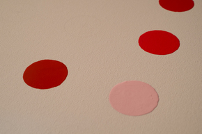
It wasn't until I saw them in person that I got it. Specifically, the spots bug.
By photograph, the pigments fall into neat order as percentages of RGB color space: apparently perfect in their shape and uniform in their tints. But in person, the chemistry of the paint makes itself known: the high gloss finish sets every candy-drop of color off of the matte canvas, a shining dot matrix. In person, you can't help but move around a spot painting. With motion, light slams off the paint surfaces and cycles into still more shades.
Compared to the paintings, I found the woodcuts and continuous-tone prints that Hirst has authorized uninspiring. No, the only way to get a Hirst on the cheap would be to paint my own from scratch.
The opportunity here was to volunteer as an assistant to Science, Ltd, albeit without permission or even knowledge. With the rules of the compositions well identified, I needed only to execute the painting. If successful, my experiment might occupy a smudge in the spectrum of reproduction and outsider art: beyond the familiar boundaries of genuine article, criminal fake, protected commentary, and student study. In one way it would be a faithful reproduction of Hirst's existing work, yet the composition would be as unique as any product of his London studio: a factory product drawn from his systems and rules. The test for success might be that it appeared secreted from the studio, not even missed in the march of product.
WHAT WE KNEW
Hirst's rules for spot paintings are already well documented by Maidman (2012), Saltz (2012), and others, including Hirst himself.[1] Setting aside a few circular canvases, and odd-balls, like his Minnie Mouse and Snooker variants, we known the ratio of spot to canvas is held constant, and rendered in a variety of pitches. We know the colors within a composition never repeat and we know that Hirst disuses pure black. We also know the color selection is not statistically random.
Accounts of Hirst's dialogue with assistants suggest an effort to position colors so as to discourage any sense of pattern. This is a step away from random, though it is intended to appear random. After all, truly random selection means clumps of color, however unlikely, will occasion a canvas. Hirst avoids that by tweaking selection. More to the point, how are the colors selected? Even once a color is conceptually selected, how does his team go about mixing the paints and tracking the results? If Hirst is to deliver on his promise of a single spot painting with a population of one million spots, surely he'll need some computer assistance. That composition will require a very accurate paint mixer (man or machine) in order be faithful to the rules.
WHAT WE DIDN'T KNOW
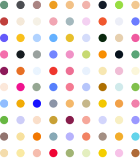
After seeing a few in person, I turned to Hirst's comprehensive website where dozens more were available for scrutiny. The studio photographs catch the colors under a perfectly diffuse bath of light—in some ways the catalog photography better delivers on Hirst's dream of pure mechanical color than do the works in person. After some study, it seemed to me that Hirst systematically preferred some colors over others. Not only does he avoid black specifically, but he seems to prefer brighter tones, on average, and there seemed to be many more hues closer to primaries than not. This was just a hunch, but I decided if the selection process had some powerful trends. If I wanted a faithful elaboration on his system for my own, I needed to decode the spots.
Using his electronic catalogue on Science Ltd.'s website, I collected data on a half dozen paintings[2] that featured moderate to high spot counts. I also favored compositions that were generally the size that I had in mind for myself. Something large enough to possess some wall power, yet with a reasonable spot count. In my study of the paintings, the most successful compositions had enough spots to generate a challenge for the eye, yet not so many that the geometry of the spot matrix couldn't be taken in all at once.
I collected the images and studied them in a photo analysis program, recording the color values across all compositions, for a total population of some 600 spots.
The data showed strong trends. His spot color selection wasn't a purely stochastic blanket of selections from a theoretically infinite color space. Far from it. In spot colors that approached white, Hirst favored just about every stop on the color spectrum equally; little bias could be seen. But as the colors dropped white and took on more black, they fell into discrete bands of the spectrum. Darker tints tended only to be tints of red or blue or green. Generally speaking, only the primary colors could approach black, while secondary colors almost never did. Purple and fuchsia hues didn't show up often though most of the brightness scale. Yellow and gold rarely appeared.
THE DATA
Spots Ordered by Hue:
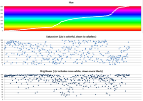
The above chart presents the hue, saturation, and brightness values of each spot in the sample set. The spots have been ordered by hue. If colors were truly random--at least through the eyes of a digital model like RGB or HSB—the plot of hues should be a straight line. Clearly there are some shades the compositions samples strongly preferred over others. It's easy to see in the pattern: big chains of colors that draw from the red and orange bands of the spectrum.
Looking at the saturation and brightness distributions is interesting. The sort is still by hue, so trends for how Hirst presents different hues are exposed: pockets and gaps show up: certain hues where the colors tend to be mostly lighter or mostly darker, mostly colorless, or mostly colorful. Intense greens and blues are avoided, but they do appear as more sedate tones.
Spots Ordered by Saturation:
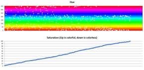
Reordering the dataset by saturation is a helpful comparison. Here the line looks nearly perfectly straight: indicating that those values were likely random or close to it. This sort provides another useful view into hue selection: they appear to be clumped rather than randomly scattered.
Spots Ordered by Brightness:

Finally, the brightness shows a remarkably smooth distribution preferring tones that include lots of white and many fewer that include lots of black.
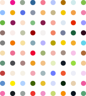
THE SIMULATION
Armed with these distributions, I wrote a short procedure in Processing to generate grids of colors matching the rates of distribution in the sample set.
Simulator output for the final composition:
Even the first result spelled out why Hirst encouraged his assistants to take care to rearrange colors to avoid clumping. At first plush these simulations didn't feel like faithful copies—the distribution of colors felt off: too cold, not enough warm tones and not enough orange and red.
I took one of many random samples as my guide image, and proceeded to explore modest manual tweaks: switching positions and pinching tones here and there, often while listening to an endless loop of Hirst interviews on YouTube, which were peppered with good-natured verbal shrugs about the meaning, economics, method, or inspiration behind the paintings. One of his most frequent crutches: the paintings were "just color—sculptures with paint."
I made some improvements over the simulated result: eliminating some colors that didn't feel appealing, moving many more, ensuring that no pattern—even if randomly produced—clouded the composition. I chose to include a pure white, even though the simulation didn't happen to call for it. I decided to retain several very dark tones that came close to black.
The full work would be nine spots wide by ten high: ninety spots of "just color." After producing a bunch of randomly-seeded computer generated simulations, I picked one that tickled me. Still in the digital domain I tweaked some colors and re-positioned still more. I also flipped the composition vertically, preferring the arrangement with some of the darker spots toward the bottom of the canvas. I soon had a final digital mock-up that felt like it conformed to the code.
Simulator output for the final composition after tweaking:
THE EXERCISE
With the code cracked—at least to my satisfaction—I now needed to practice painting.
The first study was nine spots, wherein I reproduced Hirst's compass method for positioning and drawing spot outlines.
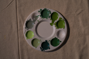
The second study was 40 spots, focused on an effort to mix household gloss to maximize the blazing finish and reproduce whatever color across the spectrum with pigment. With no background in painting, it was a brutal education in the differences between the physics of pixels and LED light and the chemistry of pigment, medium, and viscosity.
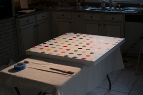
With 49 spots of experience under my belt, I ordered the precisely-sized canvas and began the final experiment.
I worked through families of color. Some pigments seemed easier to match to my CG prototype. The easiest shortcut to the many, many high-gloss oils I might need was to use enamel model paints. I worked through more than 120 Testors model paints. Some were never opened. A few were applied with no changes, as they dropped from the jar as perfect matches to my CG RGB guide.
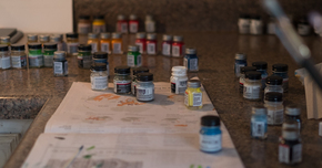
More still were slowly mixed and became improvements over the simulation. In the mixing process many colors were slightly tweaked or re-positioned on the canvas.
I worked with the canvas flat. The first few came slowly. Then a muscle memory began to take. I got better at swiftly building up the middle of the spot, then finishing the arcing edge, then filling any gaps and addressing bubbles.
Somewhere in the 70s, the novelty wore through—I was sick of making spots. Sick of the mixing and remixing. In a way, I was sick of color. I wanted the spots to stop.
As the composition got crowded, the work slowed. More drying time was needed to free up access to the next spot. The fear of ruining the canvas on one of the last few spots meant my last spots were probably some of my worst. It had been months since writing the code for the simulator, and the intellectual spur of the original project had dulled into rote manual labor.
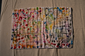
The Final Work: "Fentanyl Sulfate (After Hirst)" (2018)
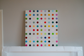
As the composition filled, the alchemy of Hirst's ur-composition took hold without warning: it was hard to stop reading and re-reading the spots: assembling chains of color, diamonds, squares two spots wide, squares three spots wide. Despite all my work, the result really felt like a integrated extension of Hirst IP. My eye made pairs and triplets: mentally assembling little portfolios of "just colour." Famous corporate color combinations were easy to find.[3]
Still others felt totally unique and unexpressed: like the inspired connection of two words never before joined in human experience.
[1] While I found footage of assistants painting spots onto drywall, I couldn't find any footage or photographs of Hirst or assistants working over canvases.
[2] One of the sampled paintings: Argininosuccinic Acid, 1995
[3] British Petroleum, McDonalds, MasterCard, FedEx, Flickr—yes it seemed every one-two punch of color ossified into a corporate logo was easy to find in immediate neighbors--and I had less than 100 spots!